project description
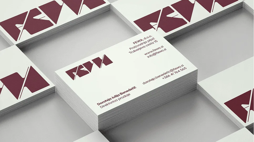
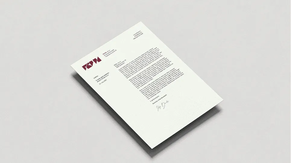
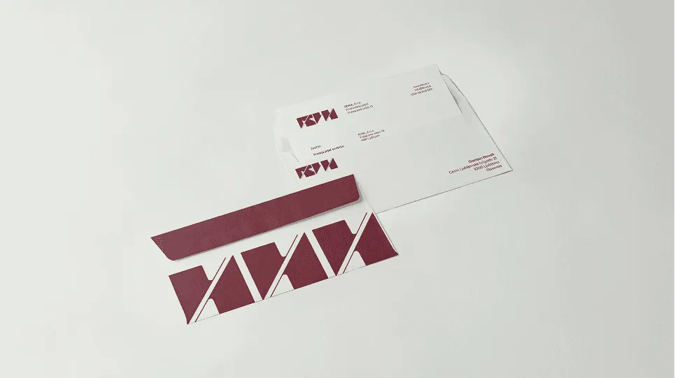
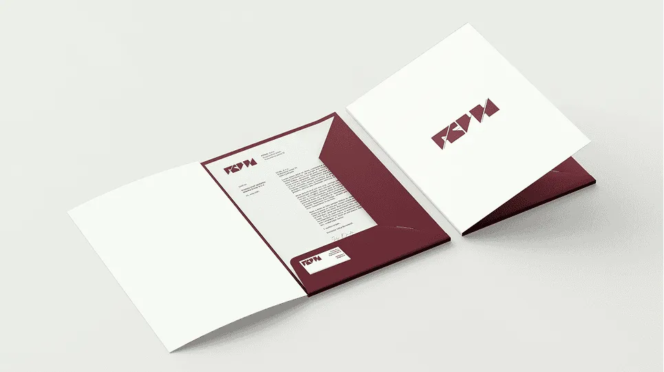
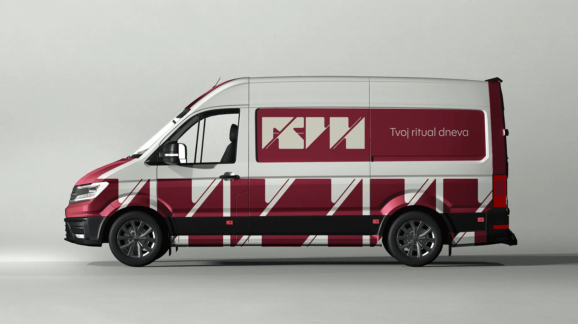
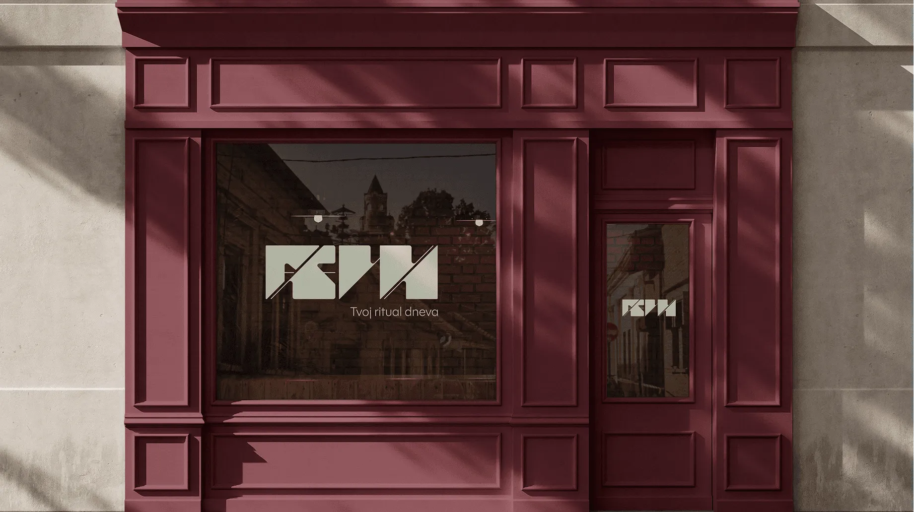
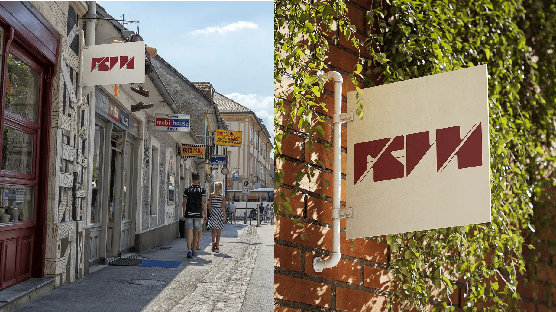
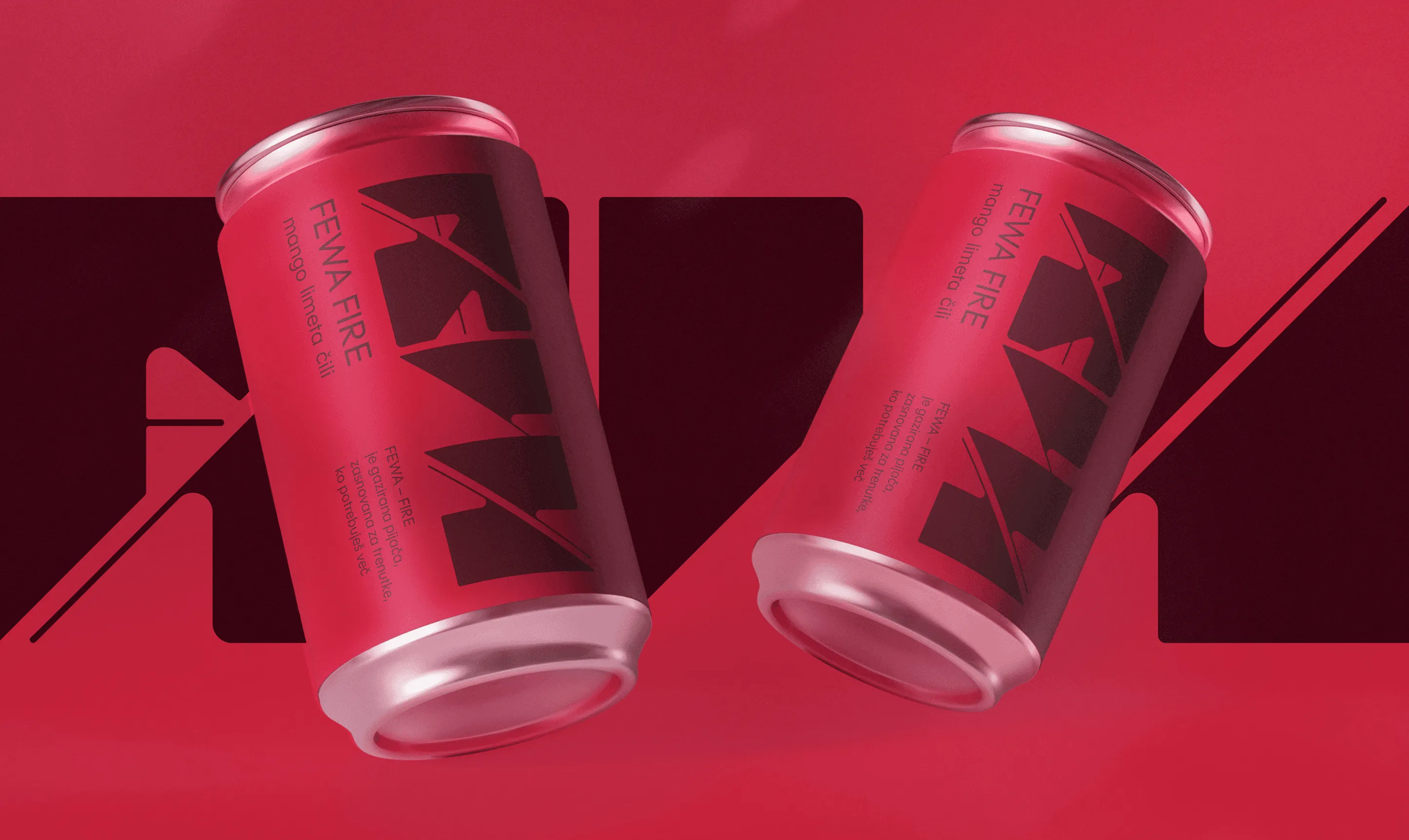
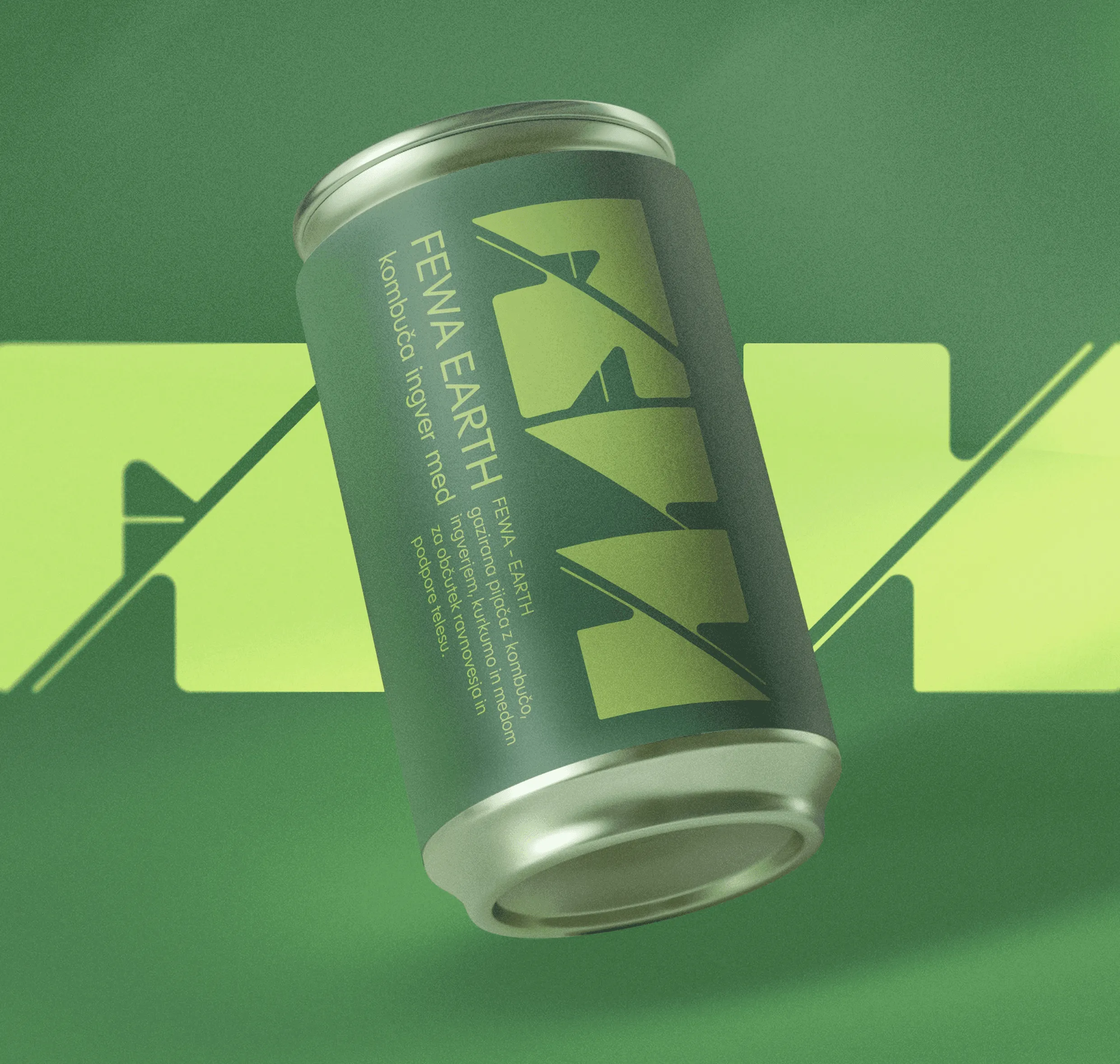
The visual identity of the FEWA brand, created under the mentorship of Nataša Vuga, is based on hand-crafted typography and the concept of the four elements – Fire, Water, Earth and Air. Each drink symbolises a particular mood, and the user chooses it according to their current state. The visual system is designed to be simple, clear and recognisable, with the aim of creating a connection between the product, its message and the user's everyday ritual. The visual identity is not yet fully finished; in the second semester I will also work on the packaging.
project type
Corporate visual identity
year
2025
my role
design and concept