project description
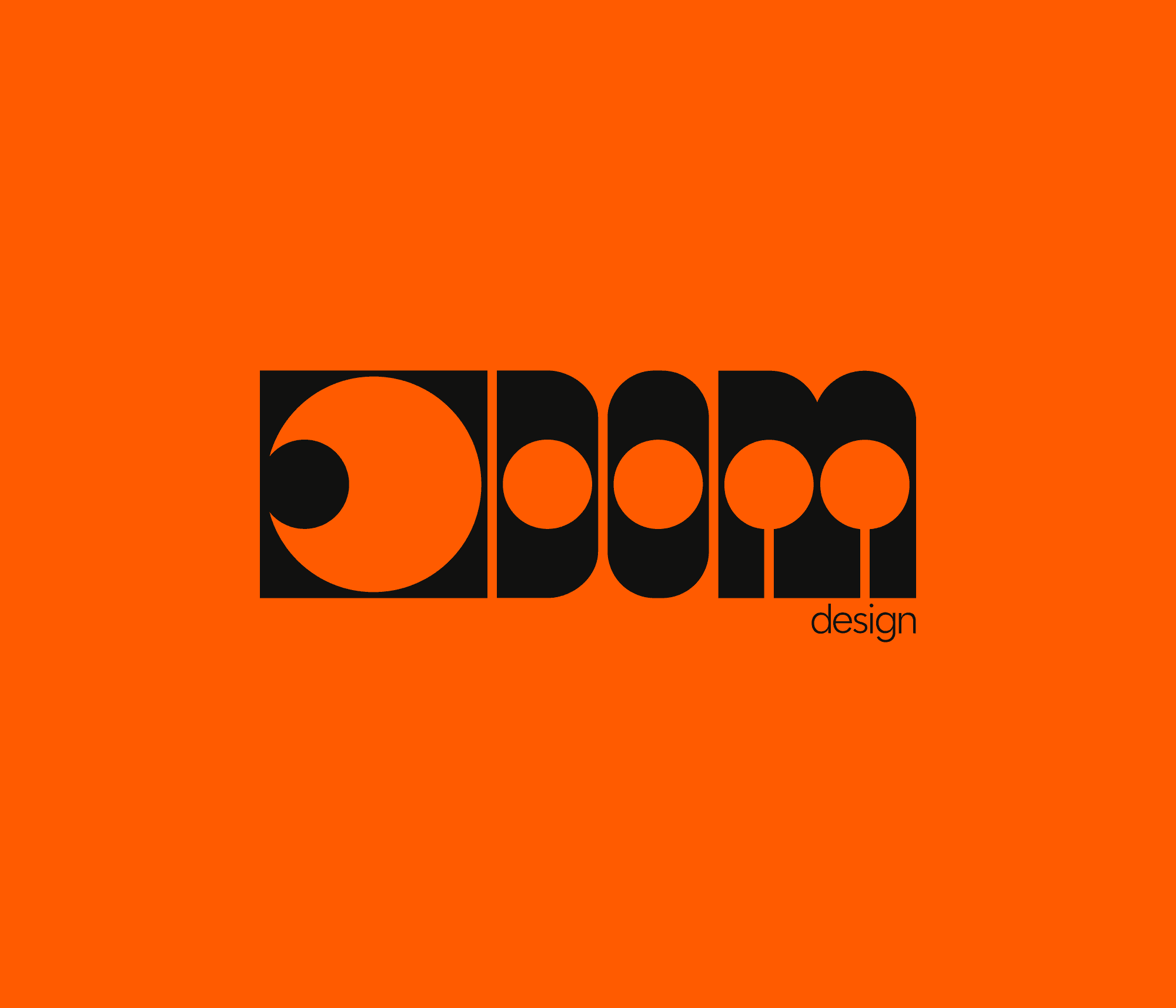
The visual identity I created for myself under the mentorship of Martina Kač Nemanič is based on personal exploration of visual identity and typographic expression. The central element of the visual identity is hand-crafted typography, inspired by typographic signage from the 1960s, a period marked by distinctive forms, character and experimentation. I drew inspiration from both the typography of the time and the colour palettes of the era, which bring warmth, contrast and a nostalgic yet contemporary feel to the space. An important part of the identity is also the symbol, which represents an eye and pupil and symbolises a ‘good eye for design’ — attention to detail, observation and visual sensitivity.
project type
Corporate visual identity
year
2024
my role
design and concept