project description
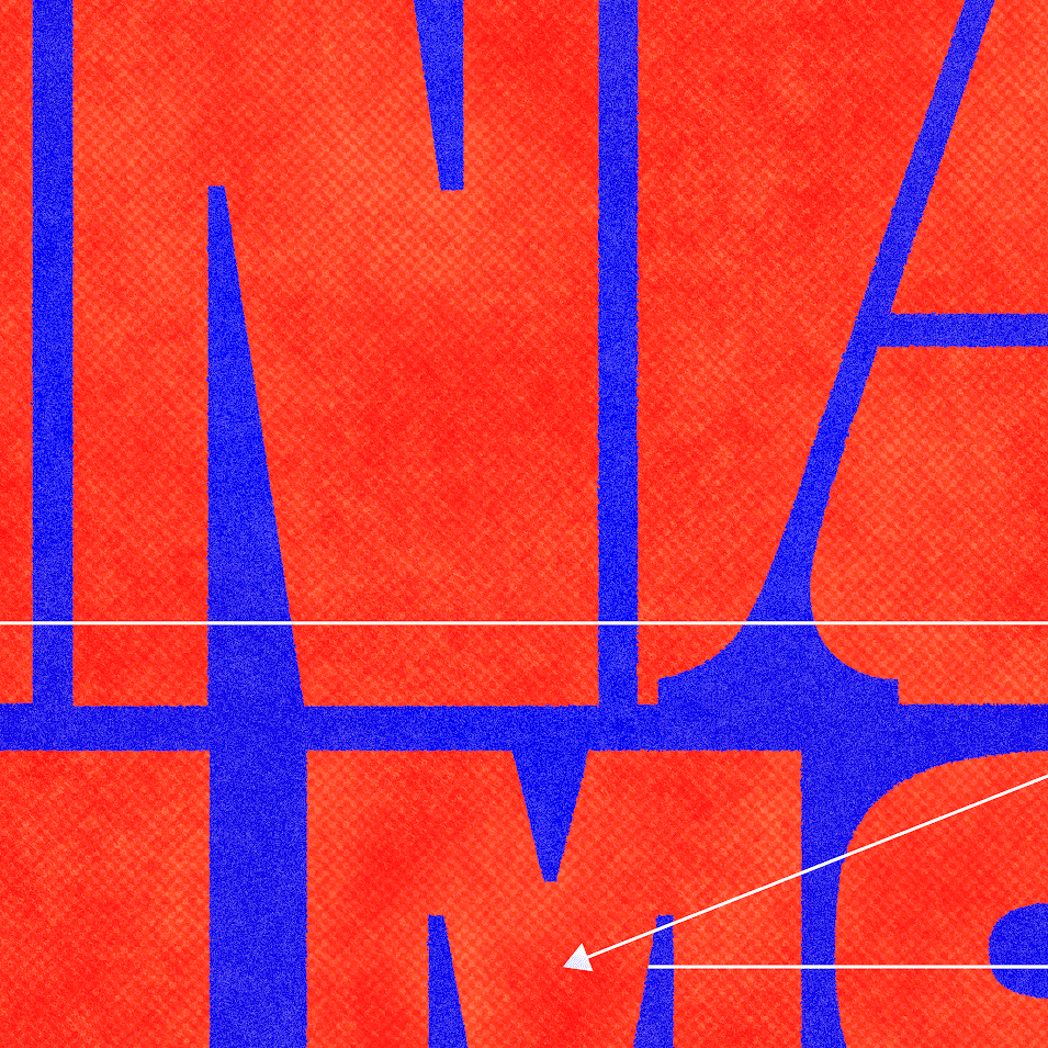
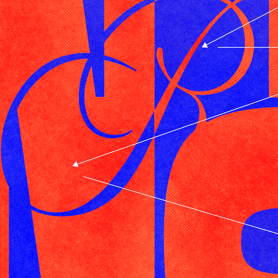
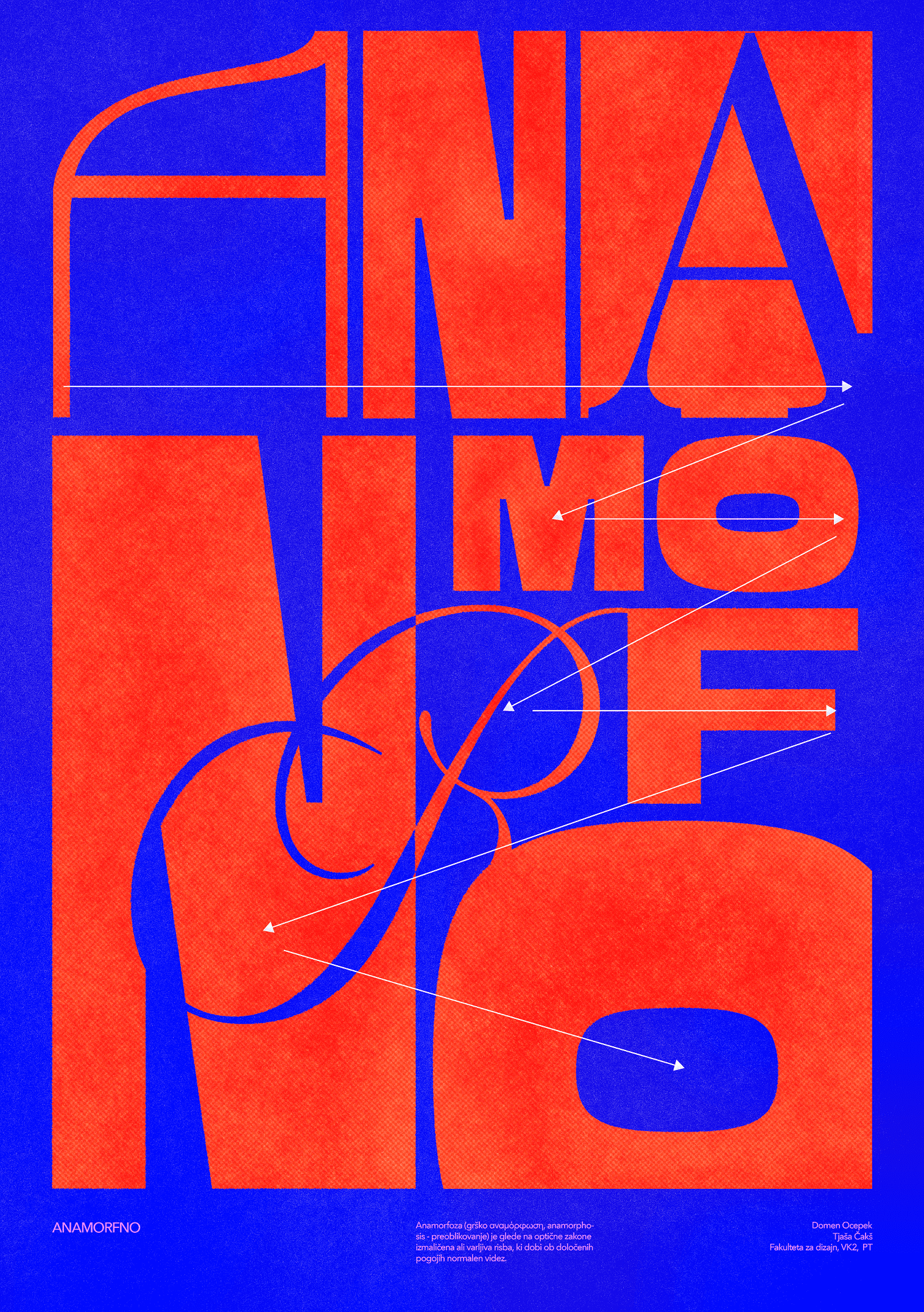
I chose the word ‘anamorphic’ and a typographic approach for the poster, as I was drawn to the idea of a distorted image that only becomes legible from the right angle or with a certain hint. I translated this concept into typography by making the word unreadable at first glance — I broke up, stretched and arranged the letters so that they appear as a pattern rather than text. To make it easier to decipher, I added arrows that guide the viewer through the composition and allow them to gradually piece the word together. I built the composition around contrasts: large letterforms against thin lines, orange against blue, and dense and open sections, which creates rhythm and dynamism.
project type
Typographic poster
year
2025
my role
design and concept